
The sensations that colors convey in the promotion of our brand, in the field of catering and food photography
The color wheel or color circle is a logical arrangement of primary colors ( rosso, yellow and blue), secondary (orange, verde, viola) and tertiary (They are the combination of the primary and secondary colors red-orange, yellow-orange, yellow green, green-blue, blue-violet and red-violet)and the relative nuances between one and the other.
The use of the wheel serves to organize and give order to the colors according to a logic that relates the various colors in order to create coherent patterns, sets of colors that create harmony between them.
Of course it is not mandatory to use the wheel and create those certain patterns!
Color has the "power" to attract the attention of those who look at the photo, transmits a message.
This is why color schemes are important and we don't use them just because those colors "go well" together.
A photograph taken following a color scheme, it will always have a balance between colors and content.
We can have a pattern:
- monochrome (you choose a color and combine it with its darker and lighter variants)
- similar (choose colors that are next to each other on the wheel)
- ADDITIONAL ( choose a color and its opposite in the color wheel)
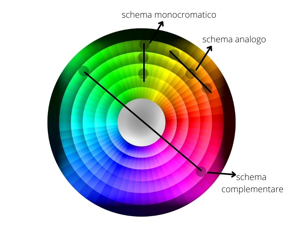
I think the scheme that "ensures" harmony between the colors is the analogous one. Personally I often like to use the complementary scheme because it creates that visual contrast that gives something extra to the image.
But as I said previously, It is not mandatory to use the color wheel, On the contrary, often "breaking the mold" is the key to an impactful image.
And speaking of impact, Let's now see how important they are from a psychological point of view and therefore in our marketing, colors.
From a psychological point of view, the complementary colors that as we know, in the color wheel they are located in diametrically opposite points , They create a strong visual effect and can generate positive reactions. However, to avoid making the contrast excessively strong, a color distribution of 80% is better - 20%.
If we want to convey a feeling of tranquility then it is better to choose similar colors that have similar shades to each other. Here too with a shrewdness: a color must be the dominant one with its shades.
Here is a list of colors with the relative sensations they transmit

So, as you can imagine, no brand randomly uses colors for its products. The color of the box of cream for young women, for example, it will be white- rosa, but for middle-aged women the colors will be more aggressive because "they will fight wrinkles".

IT'S STILL…

Let's see the colors of some famous brands and their meaning:

McDonalds: red combined with yellow = feeling of energy, vitality', youthful and dynamic.
Fanta: combination of orange, blue and green = sense of creativity and trust (Orange), calm, safety (blu) and growth, biological, safety (verde).
Burgers veggie: green and orange recall the organic and safety of the brand
Coke : red is the energy and vitality that the drink gives you.
But what happens in catering marketing and therefore in food photography?
Going back to what we said before, let's try to make a list:
For the stimulation of taste:
Yellow green = yellow is associated with the sour taste of lemon while green recalls the earth and its products. A touch of green color to your dishes will create a sense of confidence, so always remember to add green leaves to your dishes, like basil, parsley,rosemary.
Rosa = delicate taste.
Dark blue, Violet, Marrone = These colors are instinctively related to spoiled food! A steak (marrone) therefore it is advisable to serve it on a colored base, with colorful elements (edible flowers or spices).
Rosso: It is instinctively associated with sweet and passion, it is a fantastic stimulant of our appetite. Red can also be the dish in which you serve the dish.
The color of the environment is also important to convey sensations!
It is no coincidence that often in fast food the predominant colors are red and yellow (dynamic red and yellow joyful atmosphere).
In the gourmet restaurants we can find black combined with white or gold or blue which is a color that conveys elegance.
And in food photography?
I suggest you read my dedicated article.