Color in food photography e’ very important. Let's see why’
Color communicates. And the "first taste" always happens with the eyes!
Unlike other photographic fields, food photography allows you to create the whole environment that surrounds the subject. Choose the dishes to use, the background to be photographed, the cloth and accessories to be placed, etc.
Ask yourself what atmosphere you need to create for your dish and what emotion you want to convey to the viewer.
Emotion, indeed! Because each color contains a message, conveys a feeling. This is why it is important to ask you, before making your scene, what atmosphere do you want to create.
One idea would be to match the colors to the seasonality of the dishes.
Let me explain.
When we think of summer, we think of the sun, to the light, to freshness. So the colors must convey these sensations. You could choose some warm and bright colors ( rosso, Orange, yellow). Your photos will be "bright".
In spring, nature awakens, Flowers bloom… so the color could be a soft green.
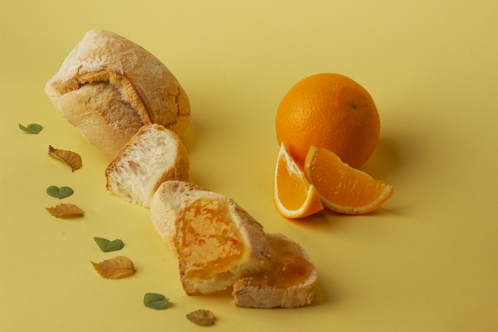
In autumn the atmosphere changes. The colors become darker, a brown, orange… these are the colors of seasonal vegetables: pumpkin, cabbages, leeks, etc.
In winter it is nice to combine warm shades (chocolate, caramel, etc) with the purity of white reminiscent of snow (we could put a white candle for example in our scenography).
But let's take a look at the table of primary and secondary colors ( Tertiaries are further color combinations).

The primary colors are red, blue and yellow. They are called so because they cannot be obtained by mixing other colors.
The secondary colors are orange, purple and green. They are obtained by combining two primary colors. For example, the color purple is obtained by mixing blue and red.
The harmony of colors is created by the presence of two neighboring colors (green and yellow example). The harmony of colors gives a feeling of balance.
The contrast is instead obtained with the presence of two opposite colors (yellow and purple).
By choosing the presence in the photo also of complementary colors, o cold and warm colors the photograph will be of great impact.

However, always pay attention not to overdo the colors! If you add too many colors, the photo can give the feeling of disorder (at least it is not a salad,per es.)
An important thing to do is to know the ingredients of your dish well. Icolori ... and maybe as a backdrop use some ingredients used to make your main dish.
Of course you can also work on the shade of the same color.

However I advise you to use to the maximum 3 colors for your photo shoot. And don't forget the white that helps a lot to "soften" the scene.
The human brain associates color with certain sensations. I recommend you read this article which I find interesting.
You might also be interested in reading which one equipment to choose for your food photographs